Vkontakte
2025
Simplifying software access for 15K+ employees
Vkontakte (VK) is one of the largest technology companies in Eastern Europe, serving around 100 million monthly active users across its ecosystem. Behind every product is a complex internal infrastructure that enables thousands of employees to securely access the tools they need every day.
Problem area
Employees struggled to request access independently
Employees relied on the Access platform whenever they needed permissions for internal tools such as GitHub, Jira, Miro, Figma, and dozens of other systems. However, finding the correct access was often confusing, request forms introduced unnecessary complexity, and navigation forced users to repeat actions throughout the journey. These issues resulted in frustration, lower satisfaction, and additional support requests.
Product before redesign

Opportunity 1
Increase platform satisfaction by creating a simpler and more predictable experience that employees could complete with confidence
Opportunity 2
Reduce repetitive support requests by enabling employees to find and request access independently, without relying on support
Design goals
What I aimed to achieve
Reduce friction
Simplify the request flow by removing unnecessary steps.
Increase confidence
Provide clear guidance and feedback at every step
User journey
One seamless access journey
Rather than redesigning individual screens, I focused on improving the complete access request journey. Each design decision removed friction at a different stage — from discovering the right access to successfully submitting a request.

Design decision 01
Find — Improving access discovery
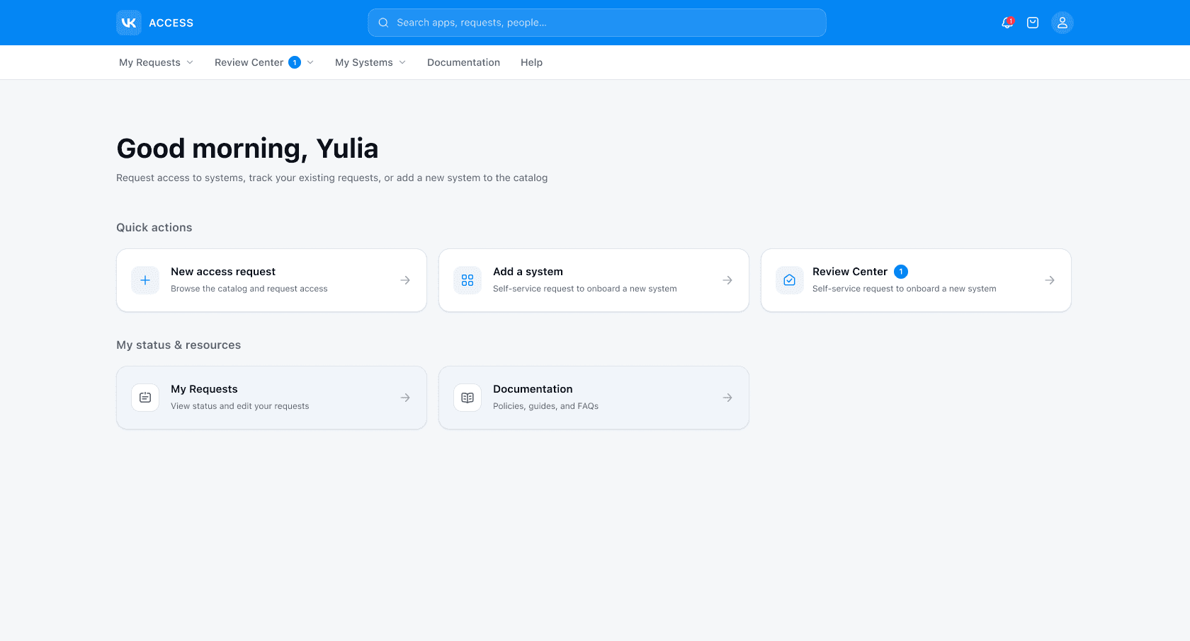
I redesigned the homepage and access catalog to help employees navigate a growing list of internal services more efficiently. A clearer hierarchy, better categorization, and improved search made relevant access easier to discover.

Key improvements
Better discoverability
Made the right access easier to find
Support when needed
Guide users if access isn't available
Clear navigation
Improved the entry points to key services
Stronger visual hierarchy
Made important information easier to scan
Design decision 02
Request — Simplifying the request flow
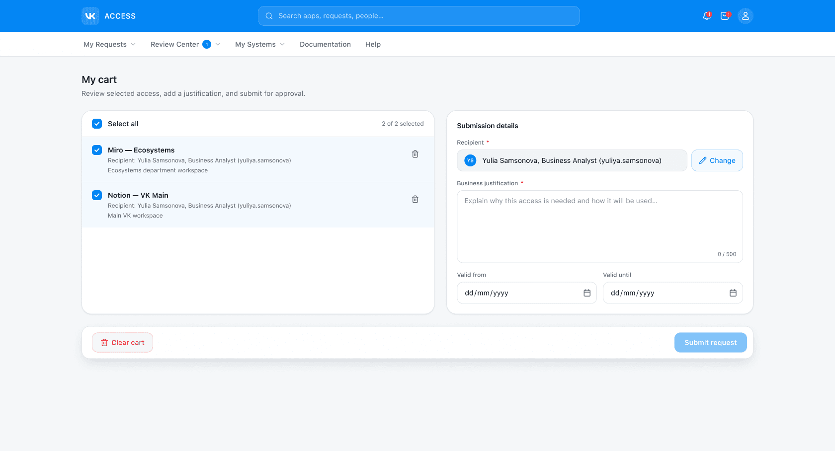
The request flow was redesigned to reduce friction and make access requests easier to complete. Service details were simplified to help employees make informed decisions, while a shopping cart introduced a familiar way to collect and submit multiple requests in a single flow.

Key improvements
Reduced complexity
Removed unnecessary steps to streamline the request experience
Request review
Allowed users to review and edit requests before submission
Continuous flow
Kept users moving forward without returning to previous steps
Batch requests
Enabled users to manage multiple requests in a single flow
Design decision 03
Submit — Reducing uncertainty
The confirmation experience was redesigned to clearly communicate what happens next, giving employees confidence that their request had been submitted successfully and reducing unnecessary follow-up questions.

Key improvements
Submission confirmed
Clearly communicated that the request was successfully submitted
Everything in one place
Included the request ID, status, and next steps for easy follow-up
Retrospective

